Accessible Travel
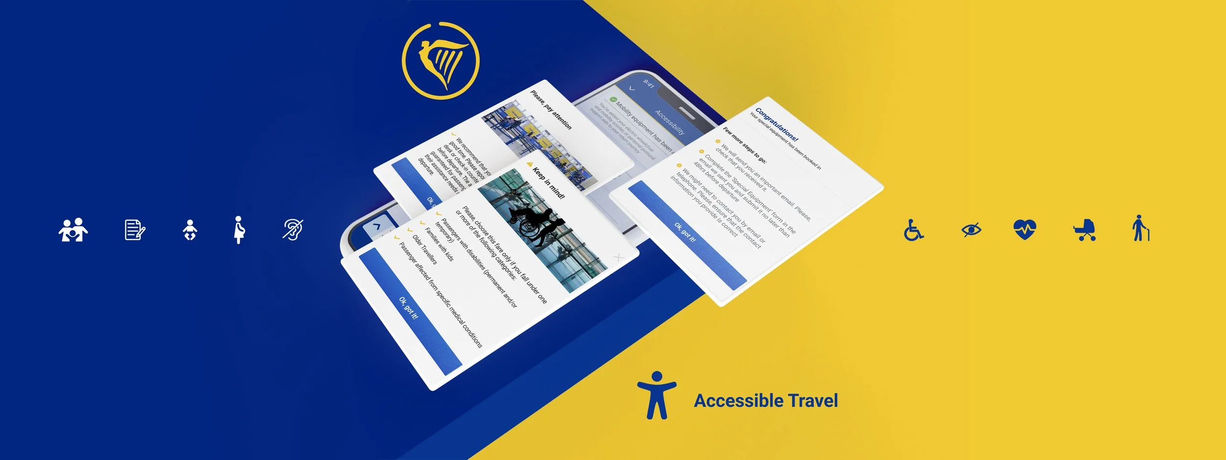
Overview: RyanAir, a European low-cost company, was chosen for this project. This project aims at giving Inclusivity and Accessibility a higher position within the app by including Special Assistance directly into the ‘Book a flight’ flow.
Role: UX Researcher, UX/UI designer
Toolkit: Figma, Adobe CC, FigJam
UX Research
Overview
• Background
The whole flight experience can be overwhelming, especially under specific circumstances:
- Travelling with a disability (permanent or temporary)
- Travelling with Children (i.e. carrying a buggy)
- Travelling after a certain age
- Travelling under specific health conditions
• Research Goals
We want to investigate what people do when seeking for special assistance on their flights, so that we understand how to implement the accessibility feature within the app.
• Methodologies
Competitive Analysis
User Interviews
Competitive Analysis
Click to enlarge
User Interviews
• Overview
5 people were interviewed. Among them - people with kids, and people who travel with mobility issues. Flight attendants were included as well in order to understand how the Special Assistance is managed internally.
All interviews have been conducted remotely by using Google Meet.
• Affinity Mapping:
Click to enlarge
Research Findings
The many shades of Special assistance
There’s a general unawareness about what Special Assistance really means
Low-cost VS Premium Companies
People tent to use Premium companies when dealing with Special Assistance
As trouble-free as possible
Avoid troubles with the airport staff and security controls
Costumer service
Specifically for Users who travel with disabilities
User Persona #1
Austin Wade
35 Y/O - TEACHER


Bio
Austin is an expat and lives in the UK. She has always travelled a lot, especially for visiting her family in her hometown. She has a three years old son and is now pregnant with a second child. She tents to use her phone when dealing with scheduling and managing things such as a trip. She’s been booking her flight tickets from Premium companies since she had her first child, because she finds the whole experience more comfortable and safe.
EFFICIENT
RELIABLE
TECHIE
Goals
To manage the entire experience of air travelling thorough the Company’s app
To have a clear idea of which kind of service/equipment is given for free
To get help from the airport staff as well as the cabin crew when needed
Frustrations
She is afraid of spending more money than necessary
She doesn’t like to queue for hours with her baby
She is annoyed when she’s mistreated because of her child
User Persona #2
Rana Sawalha
31 Y/O - PHYSIOTHERAPIST


Bio
Rana’s boyfriend had an accident after a few years they’d been dating and that event affected permanently his mobility. They’ve always shared the love for travel and they still think that it is pretty essential in everyone’s life. The disability of Rana’s boyfriend didn’t stop them. They are now travelling as much as they used to. Even though air travelling under special conditions is very challenging, Rana keeps planning new trips.
RESILIENT
CHEERFUL
EMPATHETIC
Goals
• To be able to choose for free the most suitable seat when booking a flight with special assistance
• That everything goes as smooth as possible once at the airport
• To get directions from the Airline well in advance
Frustrations
• To be forced to call Costumer service every time he books a flight
• He’s always nervous for the entire pre-departure time, because he feels he didn’t get enough information
UX Design
Prioritisation
• Project Goals
Adding Special assistance to the ‘book a flight’ flow and make it always available within the app will help both, users who need to manage and double check the entire experience of flying and the Airline itself that will eventually increase the user base and reduce the amount of complaints by angry users.
Click to enlarge
Information Architecture
The sitemap step made me conscious about the existing app. This was crucial to understand how the app works and where I could place the new feature within the flow. Therefore, after defining primary, secondary and tertiary navigation, I’ve highlighted in red the pages affected by the new feature
Click to enlarge
User Flows
It was clear from Information Architecture step that I needed to design 2 main User Flows:
Including Special Assistance while booking a flight;
Adding Special Assistance before departure.
The main challenge here was to define exactly where to make users select the Special Assistance option. Eventually, I’ve decided to add Special Assistance at the very beginning of the flow

Task Flows
At this point, I’ve identified the two tasks I’ve then tested during usability tests phase:
Add Wheelchair and free seat while booking a flight;
Book kid equipment for free before departure.
Designing these flows step by step made me aware of the many details I had to take into consideration, from the different types of disabilities and special services the company can offer to the seats and bags choices I could give for free or charged.

#1 Add Wheelchair and free seat while booking a flight
Click to enlarge
#2 Book kid equipment for free before departure
Click to enlarge
Wireframes
With the help of sitemap along with user and task flows, I’ve started building my low-fidelity wireframes. New key screens I’ve design are the following:
Special Assistance introduction screen / Special Assistance main screen / Accessibility dedicated screen / Add Extras screen / Travel with kids dedicated screen

UI Design
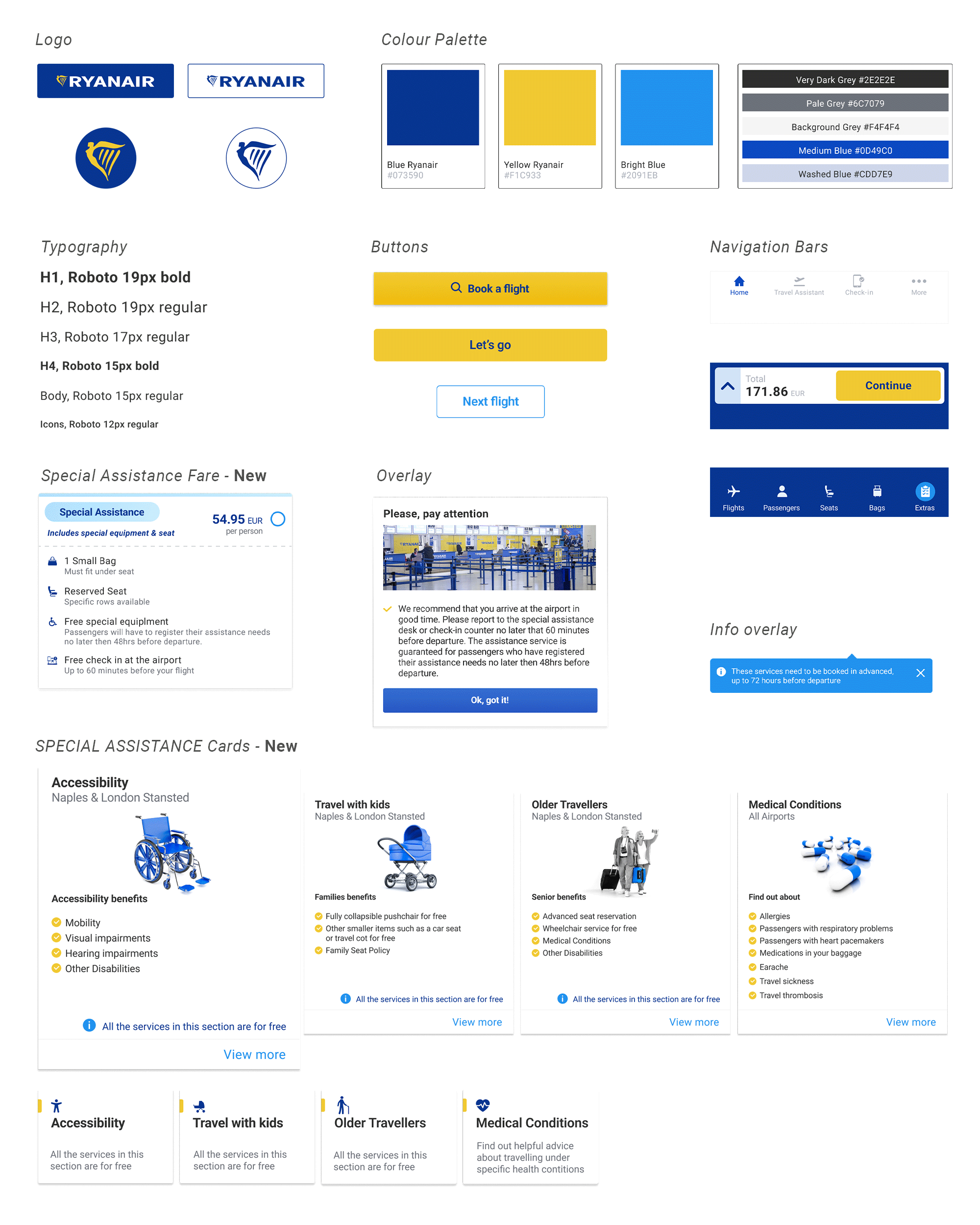
UI Library Components
I’ve collected few references online and taken several screenshots from the existing app in order to define a design system that could allow me to create consistent high-fidelity wireframes. Logo, typography, colour palette, buttons and cards are the main elements I’ve outlined at this stage.
High-fidelity key-screens

Usability Test
Prototype
I’ve explored different type of transitions and decided for the ‘Push’ effect in order to match the real app as much as possible. I found out that the use of smart animate matching layers function is helpful to get some screen elements moving from right to left while other elements - such as bottom bar - stays in place.
In the final Design, I’ve also included some basic animations - i.e. loading icon - to make the prototype experience more realistic.
Outcome
The prototype I’ve created has been tested on 6 participants. Age range of them: 25 to 35 y/o
Simulating the ‘book a flight’ flow was not an easy task. I’ve collected lots of feedback, some of them quite interesting as well as unexpected. This helped me make several small updates in order to achieve a smoother flow.
Click to enlarge
Iterations
• To improve communication
- Additional message after choosing Special Assistance fare to clarify who it is addressed to and what to do next
- Fixing bags allowance screen and making it consistent with ‘Special Assistance’ fare.
- Giving information during Second Flow about the possibility of booking ‘Extras’ only up to 48hrs
- Using different colours for counter cards (same as fares cards), when choosing free baby equipment over charged one.
Click to enlarge
• To improve flow:
- Not giving Special Assistance as optional for a second time during the booking flow, it’s confusing and misleading.
Click to enlarge
• To improve prototype experience:
- Implementing with ‘Special Services Added’ screen. When users go unexpectedly back after choosing a specific service - maybe just to double check that - they need to see that option already selected.
- Adding carousel Animation under Special Assistance screen to make the prototype experience more realistic
- Adding status bar to each screen
- Creating Loading Animation to make the prototype experience more realistic
Click to enlarge
Test Project Prototype
Key Takeaways
• Challenge
Dealing with an existing app has been pretty educational, because it let me dive into a pre-built design system. I was able to closely study use of colours, font, cards and buttons dimensions and general layout.
On the other end though, it was quite challenging to create new screens because I had to always prioritise consistency with the old design. This affected not only UI elements, but also UX design and the entire flow.
In some cases, the existing design system proved to be outdated and incorrect especially in the matter of font sizes. I’ve tried to always respect the original design. Although, I’ve fixed it here and there to make it look more unified.
• Lesson learned
There is always space for improvement and users represent a precious source of new ideas! However sometimes, it’s good to think it through and make serious assessments before changing the design completely.
Some of the participants, who are very used to Ryanair app, were expecting to find Special Assistance not before the final step where they normally add extras. However, Adding the Special Assistance as specific fare proved to be helpful for all participants who were able to set their seats and needs since the beginning of the flow.